The number of smartphone users is forecast to grow from 2.1 billion in 2016 to around 2.5 billion in 2019, hence mobile users expect a lot from the app – less load time, smooth experience and getting delightful during the interaction.
There are about 5.8 million apps(including Apple App Store and Google Play store) so adapting to the context of use, while keeping the interaction levels as low as possible (reduce the number of events and actions are required to reach to the task end or complete it) is quickly becoming a necessity standard for many apps.
Essential UI and UX elements helps to better the user experience and user interaction with any apps that they use. UI and UX has now become a strong proposition that helps provide a seamless user experience that helps to gain more users for the mobile apps.
If the experience of the mobile app is not great then the user will abandon the app and never come back. The difference between a good app and a bad app basically depends upon the quality of usability and user experience (UX). A good UX helps to create a successful application from unsuccessful ones. If you would like to know more about UX design, whether you are interested in it as a hobby, or as career you might want to check out somewhere similar to https://www.springboard.com/workshops/analytics/ for more information.
If you want your app to be successful, you need to understand what exactly can be considered as a “good user experience”? It might be helpful if you know more about user flow. If you are looking to learn more about user flow you might want to check out somewhere similar to slickplan to find out more about user flow to help your user experience.
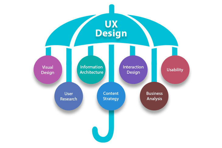
Heading on to the ocean of user experience, it involves a variety of activities—user research,
Questionnaire, user interviews, competitive analysis, data gathering with affinity mapping, creating user persona, user case scenarios, information architecture, wireframing, feature lists, interaction design, user interface, content creation, prototyping, usability testing.
-
UX process is so vast right from the research to UI

For now, To simplify the task, I’ve prepared some highly practical tips on what you should and what you shouldn’t do when designing a mobile app. Follow them or have the best practice of it as you’re designing your app’s experience.
You need to perform the right kind of research that empowers you to understand what UI essentials stands about. The research must be thorough and must be accompanied with appropriate statistics backed by studies and papers that supports claims.
Let’s first talk about the soul of every user experience design – Research! Without this one fundamental step, none of the strategies will be useful.
-
UX Research
When we talk about UX research we mean getting information from various aspects such as business logic, target audience, interview outcomes and data gathered to map personas. A good research.ensures that your app is usable and conceivable or probable. For a good solution, it is advisable to learn about your stakeholders, market trends, competitor analysis, and target users and their problems.
You must go through the following research types to get a good idea about your user and their needs:
-
Qualitative Research :
It is sometimes called the collection of non-numerical data by observation.it tells you the difficulties user facing the events and call to actions and what else they notice and see on the page rather than CTA. In such type of research, you actually go to the user and asks questions and carries interviews and gather the valuable information that helps us design in an informed, contextual, user-centered manner.it mainly understands the attitude of the user for the respective tasks.
Qualitative research will provide you with facts and designing principles that helps you to create a seamless UI for any app that you require.
UX is mainly of qualitative research.
Quantitative Research :
Sometimes called the collection of numerical data by investigating users.it tells you the user percentage able to finds the events and call to actions properly on that page and statistical data which tells what happens in the application..in such type of research you can ask more personal questions to use and know the behavior of the user.
PRACTICAL GUIDANCE
- Identify your target audience and interview them and collect their data in the form of sticky notes and try to find the similar pattern in their answers i.e affinity mapping which will help to understand how users will interact with your app and build the personas which will then help to carry out features on the basis of their needs and behaviors and problems.
- Do competitive analysis finds apps that are similar to the one you’re designing, find out the similar features and try to give the new features rather than existing in competitor lists.
-
Necessary Features
By mapping user personas and user scenarios you can get important features based on the needs and
Goals of users but to make an app more attractive to users, many product designers try to add as many features as possible. Unfortunately, this rarely results in better user experience. Nothing is more confusing and difficult to understand for first-time users than an app that has too much going on. The most successful apps available on the market are highly focused and present a limited set of prioritizing features. Thus, limit your app’s feature set by prioritizing what’s most important and trimming nice-to-have features.
You can prioritize features in three main categories such as Must Have, Should Have, Could Have
PRACTICAL GUIDANCE
Know the core features of your app and for a purpose, it is going to made and the which feature is useful to make a seamless experience
-
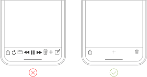
Decluttering and Reduce Cognitive Load
There’s is the concept “Choices of Paradox”.In general term, the more is less which indicates overloading with too much information and UI Elements makes screen worse because it has limited screen space.
It has a negative impact on the user. It’s essential to get rid of anything in the design of a mobile application that isn’t absolutely necessary because reducing clutter or cognitive load will improve comprehension.
The good UI design is all about delivering relevant and necessary information (signal) and avoiding irrelevant and unnecessary information (noise).
PRACTICAL GUIDANCE
- If you want to reduce cognitive load or clutter on a screen which represents a part of the user flow or a user journey — show only what is necessary on the current step of the task or its flow. For example, when a user wants to make a choice, show enough information to allow them the choice, then dive into details on the next screen(s).
- Keep interface elements to a minimum. A simple UI design will keep the user at ease with the product.
- Use the technique such as progressive disclosure to show more options.
-
Use Simple Navigation
Navigation is very crucial for mobile design. Navigation should be intuitive and friendly and prioritize navigation based on the way users interact with your app Give prominence in the UI to paths and destinations with high priority levels and frequent use. Organize your information structure in a way that requires a minimum number of taps, swipes, Buttons should be clearly labeled with proper attributes.
The user will not able to understand if you write jargons.
PRACTICAL GUIDANCE
-
Use Functional Animation to Clarify Navigational Transitions
The animation is the best thing or way of representation to describe state transitions. It helps users to know or comprise the change in the page’s layout, what has triggered the change in that page layout, and how to initiate the change again when it required. Functional and motion animation can efficiently guide or helps to capture the user’s attention and make complex transitions easy to understand.
-
Don’t mix navigation patterns
You should use the primary navigation pattern consistently throughout your application. There shouldn’t be a situation in which your app has different types of navigations such as your app has a tab bar in one part, while another part has a side drawer
-
Make navigation visible
Limit the user’s memory load(cognitive load) by making actions clear, smooth and options visible. Don’t show the navigation when we anticipate that the user needs it rather it should have available at all times.
-
Thumb Rule
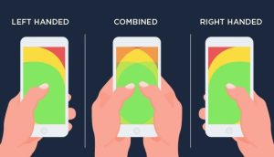
The thumb rule is also called as “one thumb experience” and it is typical mobile user experience and it was discovered by Luke Wroblewski, he also states that the highly distracted environment causes most mobile application users to engage in one-handed use with minimal spans of partial attention. Another research done by Steven Hoober on mobile usage found that 49% of people use one thumb to complete the tasks and get the things done on their mobile phones. The famous book of Josh Clark, “ Designing for Touch”, took this study of mobile usage a step further, where he states that 75% of interactions and the things getting done over mobile are thumb-driven. Having the knowledge of tap targets, When designing a mobile UI, is a very important thing in UX case studies. The tap targets or the action-driven events should be big enough for the user to tap easily. The smaller the action event or the tap targets, the user will have a tendency to tap on the wrong target or will take you to another task.
If the user will able to perform particular tasks or number of tasks within a minute using just one hand then it will help you to get the right design or you can actually look for the flow of thumb zone as another important tip while the design. if you don’t want your users to tap accidentally anywhere then the negative elements should have in that zone which is hard to reach the area and the most usable and frequently used elements and common actions in easy to reach zone area, which helps in empowering users in performing tasks with ease.
As we require enough space for tap or click the call to actions or UI elements then you should keep in mind the space and size of the action buttons while designing
- Always use design principles while making UI
The principles of designs always help you to create a great design(mobile app interface) and its functionality (mobile app user experience)
You will definitely lose track and find yourself in a mess while designing when you have huge chunks of data and very limited space, then the basics of design principles would guide you back.
PRACTICAL GUIDANCE
-
Clarity
If the tasks defined in your applications are not done at the earliest possible then there’s the chance the user will abandon the app so correct design always helps the user to complete its task as early as possible making the process very intuitive. always have the right design path for first-time user approach will he get it to know at first glance within very less time.if the user can make it possible at first glance then you are heading in right direction, in short clarity helps to remove unnecessary and making the design simpler
-
Consistency
consistency throughout your application flow will reduce the need to rethink and remember; what we should really target and having the aim at is associating users with a particular pattern and they would have an opinion or reckon what needs to be done easily.
-
Familiarity
Not everything needs to be out of the box.peoples are always comfortable with the familiar things
You just need the best out of thousand similar out there by not making a maze of puzzles for users,
So the subconscious behavior of the user and the conditioned patterns use to make familiarity.
In terms of example Don’t innovate payment gateway.
-
Breathing Space
The negative spacing and white space around elements used in the application is important to get the attention on the content and increases the content values with greater readability and clean user interface.this is the most important and vital thing to be considered while designing the mobile applications.
-
Proper Contrast
Color plays an important role in any platform so defining the primary secondary and tertiary colors helps in increasing the usability of an app. users might be outdoors with low contrast on the screen because of lighting so you need to have special attention on the color chosen while designing an app.
-
Legible Text
Greater readability is the main problem consider while designing because according to the thumb rule the text should be of 11 points and it needs to be legible at a typical viewing distance without zooming also, the mobile devices have very less space and you should not fill that space with chunks of information as you need to use white space generously and play around the type to maintain readability.
Must Read: Top 9 Vital Elements for any Website Design
- Create a seamless experience
A typical user is always looking for a seamless experience in all the device he is using an application
Because you need to maintain that seamless behavior across all the devices such as mobile tab and desktop.
PRACTICAL GUIDANCE
-
Synchronize a user’s current progress.
The user journey should be very clear and has to be synchronized with all the possible devices. For example, the shops few items from an e-commerce app and he wants to switch himself to desktop version for payment gateway or complete the checkout then he would expect to continue his journey where he had stopped.
-
Anticipate user needs
Whenever you think the user will be stuck in your app then always proactively look into the steps of the user journey because he might have needed help
-
Design a good onboarding experience
If you want to retain your lost users then delivering an excellent onboarding is the main base for it and becomes the foundation for mobile UX. Onboarding helps to show the value your app provides.
There are many strategies for onboarding, one is very effective: contextual onboarding. Contextual onboarding means that instructions and necessary information are provided only when the user needs them. Duolingo application is an excellent example. This app pairs an interactive tour of interaction relevant information with progressive disclosure to show users how the application works. Users highly encouraged to jump in and do a quick test in their selected language. This makes learning fun and discoverable and interesting.
Usability Testing
We need usability testing at three stages such as strategy, concept, and post-execution which is widely used in most of the companies to conduct UX research.
Watching the behavior of user navigation in your app and their actions and feedbacks helps to create raw data for the design team for analysis.
A/B Testing
A process that allows testing two different versions of a page. The display of various versions varies on your website to see what user respond to best. Companies similar to Pegasus One software development company can provide some useful insight on A/B testing and app development in general.
Providing guidance in knowing what to adjust on your web page, altering the size, placement, and color of a
Any element or the wording of a single phrase or a sentence can have dramatic effects. A/B measures the results of these changes.
Related: Top 10 Best Practices in Website Development Process
Mood Board
Mainly to understand how the user perceives the topic in a visual way to help build the UI and the style for the same such as Creates a good understanding of colors, Visual language, and Visual objects
Diary Studies
Diary studies is a research method that collects qualitative information by having participants record entries in log or diary about the activity or the experience being studied. This collection of data and user records uses a Longitudinal technique that it is nothing but it is reported by the participants over a period of time ranging from some days to few months, that means it studies the same variable over the period of time
This consist of 2 open and closed card sorting both have their benefits open helps us get a better understanding we are clueless and closed helps us relate to its arrangement
5-second test
A 5-second test is usability test in which a participant is shown the user interface of a software application or a website for 5 seconds and after the test the participant is then asked what he can remember from the layout.
Paper Prototype test
A paper prototype helps you set the basis of your gestures and interactions of the experience, it’s not paper but a whole lot of craft.
- Helps you to solve wizards, onboarding screen
- To be made as a mockup to help gestures and new mediums
- Very important for understanding ergonomics of the app
Click Test
This is the basic test to understand if the user can differentiate the difference between clickable and unclickable things
- To be used before we start creating wireframes or at an initial stage
- This helps us create new kinds of hyperlinks and test them
- This does not need to be in a flow but can be done on single pages too.
- This can also be used for determining which links did the user click the most too.
Task Test
This is one of the most important tests, which covers many things this can be used post-launch and post design too.
- Each task is tested on pre-defined metric
- Helps us understand the success of the task • Needs to be KPI driven
Task Success: 100%
Error Rate : 0%
Level Of Satisfaction: 100%
Motion Failure Rate : 0%
Time on Task
Conclusion
A great design is the perfect combination of user interface and functionality i.e is the seamless user experience, and that is exactly what you should be more focusing and aiming when you looking for building an app. Never have that starve to build a perfect app right on the first attempt. It almost impossible. Instead, always consider your app as a continually evolving project, and get the use of data from usability testing sessions and user feedback to constantly improve your app experience.
So if you follow proper guidelines and the UX research you will end up with seamless user experience without the user scratching his head to understand how the product works and what its user flow. Before starting mobile app design know your target audience by UX research and competitive analysis also from
creating lean personas, user journey map. So that you know who you are designing the product for. The better you know your target audience and their needs, the right seamless experience can be created for them.
We hope that you liked this article and have found it fulfilling to your requirements, if you found out the infomation useful, check out our other blogs as well. If you have any requirements for UI UX desiging then do contact us at enquiry@nimapinfotech.com. We have experienced and talented designers and developers ready to onboard your project with 100% user satisfaction and pleasant user experience.
Do you want to Hire UI UX Designer
You can also hire UI UX Designer in Dubai, UAE.[/vc_column_text][/vc_column][/vc_row]